
Sherwood Massage


Sherwood Massage is a forward-thinking clinic that combines holistic, sports, and clinical massage services to achieve desired results for their clients. Their attentive service works to really understand the roots of pain. Together, the therapist and client craft a unique treatment plan to address ongoing concerns and significantly alleviate discomfort.
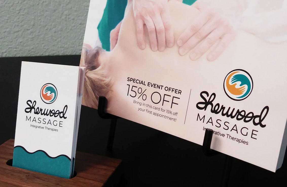
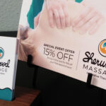
As a newer clinic in town, the owner, Heini, sought to establish a defined look that set her apart from other practices in Sherwood, Oregon. The logo needed to convey a therapeutic feel without being too new-age looking. Being a massage service, the main tools of the trade are the hands. After a number of more abstract ideas were explored, the swirling hands emerged. They convey the notion of a synergistic relationship between the client and therapist. Negative space between the hands along with the circular frame indicates a flowing motion. This is a key concept in massage, depicting circulation and mobility. These ideas are reiterated in the hand-rendered script that makes up the word, “Sherwood.”
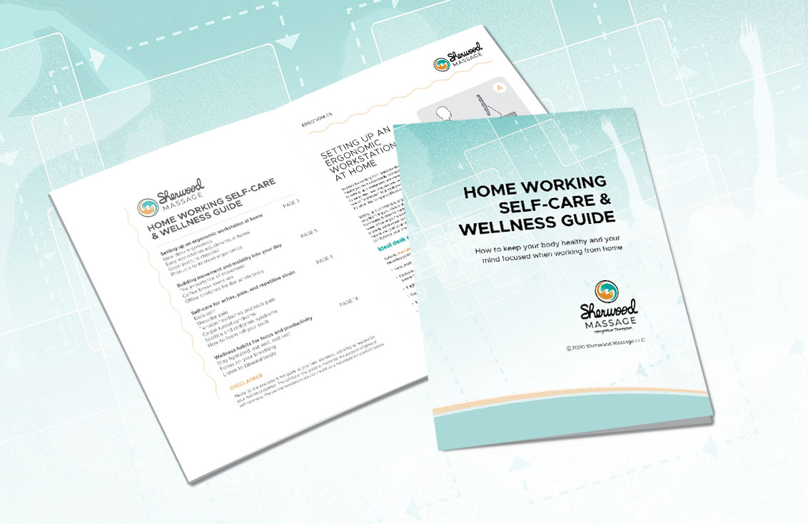
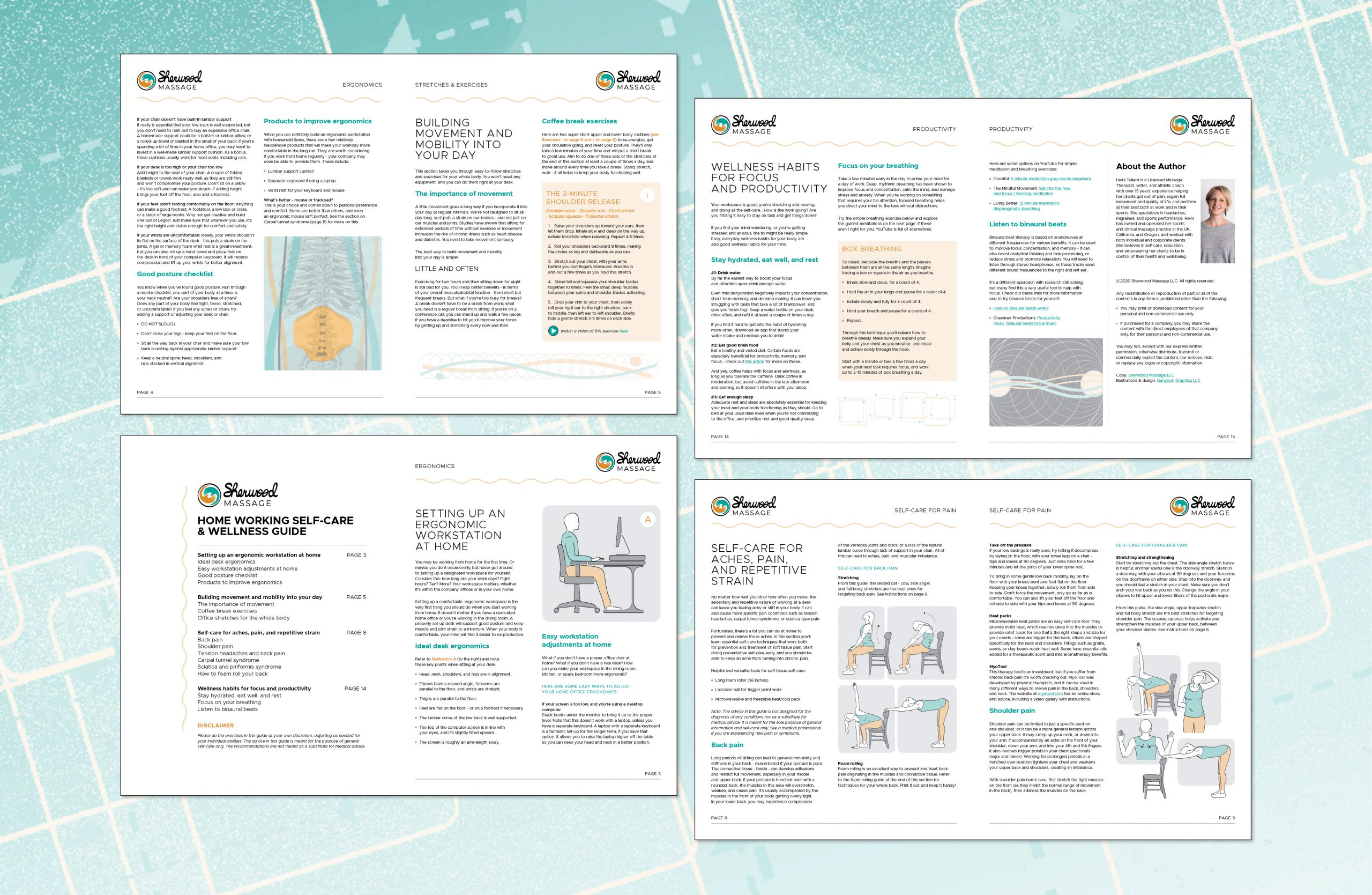
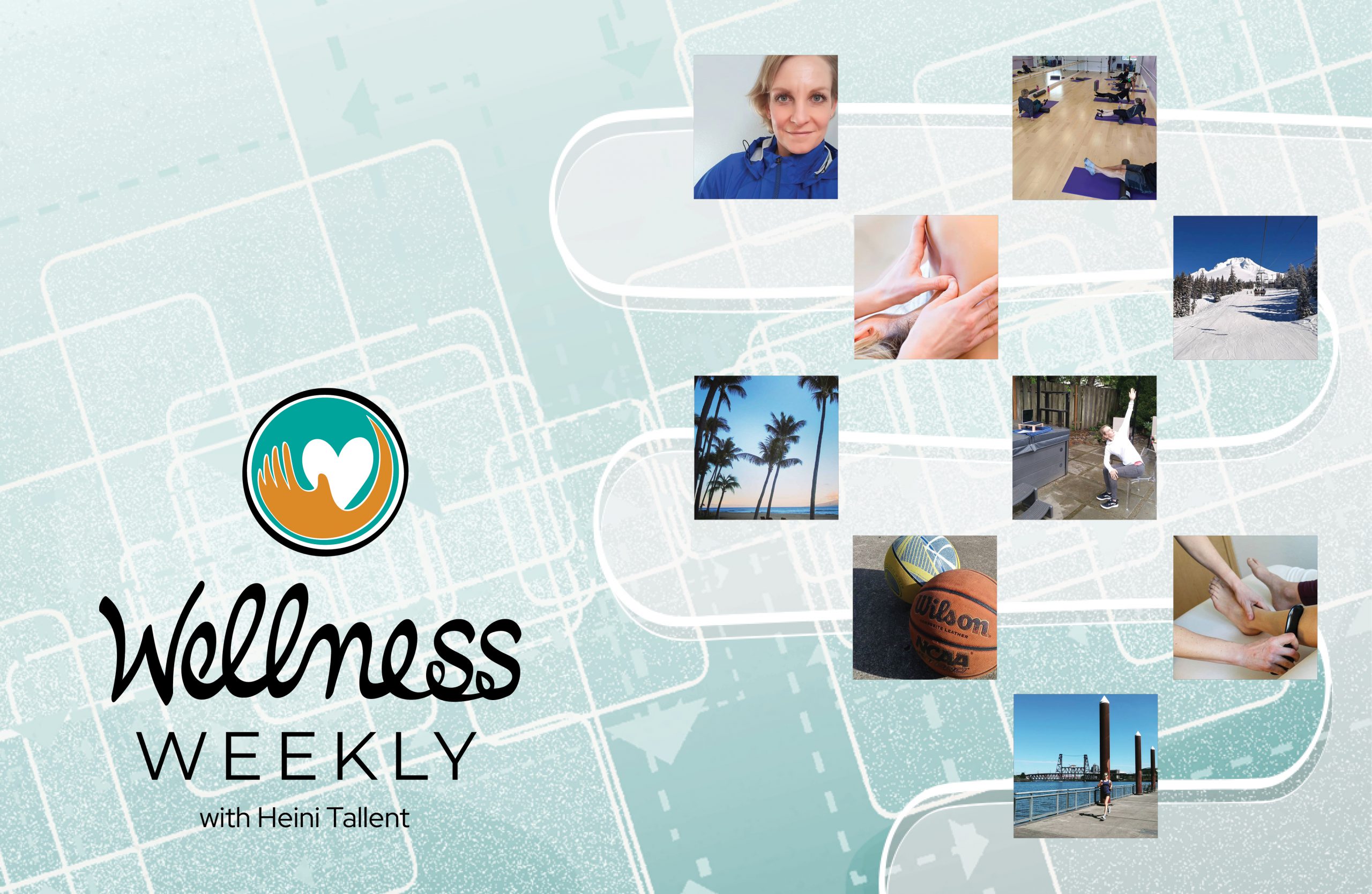
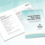
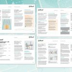
Sherwood Massage’s integrative approach has made profound differences in people’s lives. Since upgrading their branding, the clinic has been more firmly established in their community. A website overhaul along with an increased social media presence has been key in this effort. Despite the onset of Covid-19, the clinic has persisted remotely with a wellness program to help people working at home acquire better habits and lasting improvements as they redefine workspaces and habits. Ganyoon Graphics helped to create an illustrated guide with instructions for stretches and posture. An additional logo, based on the initial Sherwood Massage mark, has been designed for this program as well.